Wednesday, 6 February 2013

Final magazine cover

Here is my final magazine front cover I followed the drafts that I produced for previous tasks. I based it around my first draft design which was firstly aimed at the age’s post 16. But I wanted to change to age so that it would appeal to the whole of the school, this includes ages 11-18. The cover lines within my magazine are what make it appealing to all ages and genders. I used the most engaging image to become the key image for my magazine. And I created a main story to link in with my picture. All of the cover lines and stories fit in with the correct institution and audience for my school. The pictures I have used hold the correct conventions for what my magazine is based upon. Also I think the layout works really well and creates a good feeling for a school magazine. I think my target audience would read this magazine if it was printed.

Monday, 4 February 2013

Background Photography


For my contents page I wanted to have a bright background but I wanted to use my own photography which still held conventions of the Arts. So I decided I would splash paint onto paper and then take photos of it. I decided to use to colours I have used so far in my magazine so it would create and match with the house style. Also I tested whether it would look better with the flash on or off, this is why you can see two different tones of paper in my photographs. I decided to go with the one that had the flash on. Because the paper is brighter and the colours stand out more, this will be eye catching for my audience and very engaging.

Chosen Photographs


Here are the 7 main photographs I am considering using in my main magazine. I have chosen these because I think they are the most engaging and hold the most conventions of Arts to fit in with my magazine. I think they are good because they vary in the different art subjects which will give my magazine variety and reach to a wider target audience.

Photography


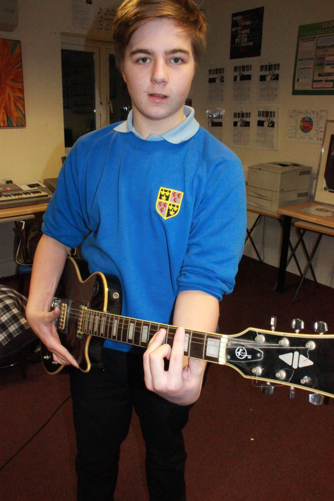
Here are the photographs I took within my school, I knew I needed to take photos of students with the convention of Arts. So I went into some GCSE Textiles, Art and music classes to see if I could get some good photographs. Also I decided to go into the school main hall while the students where rehearing for the production. I think these photos are good because they match conventions and the genre of Art which is the whole idea for my school magazine. After this I will then pick the ones I think are the best and most engaging towards audience, and which ones will attract my target audience into reading this certain magazine.

Thursday, 31 January 2013

Institution

The institution which my magazine has been created by is a school. I have used aspects from Trinity School which is a Christian society. Therefore some elements in other typical magazines could be quite inappropriate for this institution. Such as in a Christian school magazine it would be inappropriate to add stories or cover lines with subjects such as relationships involving people in the school. It would be unrelated to the school life and also the Christian community. Another reason why I am unable to include subjects like that is because of the target audience, the age range of a school is about 11-18. As all the pupils are mostly classed as children they are still in parental care, if there was unacceptable topics in the magazine some parents could complain. So everything created has to be acceptable for the whole school and Christian religion. This is what consists of the school being the institution, you have to be careful what you write about and include in the magazine.  

Monday, 21 January 2013

Audience

Audience is a very important element for creating and designing a magazine or any media source. Everything created within my certain genre of magazine will be aimed at a specific type of audience, this could include things like age, gender or interests. For example the type of magazine I am aiming to produce will be targeted at the ages of 12-18 which is the normal age range of a school. As my magazine is for a school it fits perfectly. Also I am aiming to make it appealing to as many people as possible because I want this to be a magazine for both male and female. The stories inside will need to be engaging for everyone. I will achieve this by using gratifications theory so I will include: Diversion to help audience escape such as a game or a puzzle, personal relationships which will be a story that creates a bond with the audience and creates emotion, personal identity like a fashion page or gossip, and surveillance which in a school magazine could be exam time tables which inform the audience. I will try to include one or two of these elements into my cover lines and contents page.

Sunday, 9 December 2012

Magazine Draft 2

Draft Design Two: Here are my second design layouts for a school magazine. I think this one has a slightly different target audience age, mainly being aimed at a pre-school age. because of the font used for the masthead, it is a sans font which use different colours for each word, it creates a child like type of work. the overall layout of the magazine is good but I would only change the masthead, and also remove the price tag as that is not a convention for a school magazine as they are usually free.