Main task: To design and create the front page, contents and double page spread of a new music magazine. Developing ideas through research and analysis into existing products in the current market. This is to be based around a certain genre chosen by myself. The magazine has to use key iconography of the genre and follow the same house style throughout.
Thursday, 28 February 2013
Thursday, 21 February 2013
Evaluation
In what ways does your media product use, develop or challenge forms and conventions of real media products?
The media product I have designed and created uses conventions of real media products. This has been achieved by research and analysis of existing products in the current market. As the task was to create a school magazine, I had to look into the key conventions that a school magazine would use. I have used the typical convention of a key engaging image on the front cover of the magazine, the cover lines running down the page and also a masthead which spreads across the top of the page. For my contents page I also used similar conventions which I had looked into during research. I developed my ideas by taking aspects from different magazines to create the beginning drafts for my magazine.
How does your media product represent particular social groups?
My media product represents a particular social group, which are school pupils with an interest for the arts including subjects such as Art, Textiles and Photography etc. The title of the magazine ‘Trinity Arts’ shows the clear social group it has been aimed at. And also the tag line ‘Bringing out the creative side in everyone’ so anyone who is interested in becoming creative or anyone already involved in the arts will be the key target audience for this magazine.
What kind of media institution might distribute your media product and why?
As I have produced a school magazine the institution will be a school, they will be the ones to distribute my media product. This is because the audience I have decided to aim my magazine at is of the age 11-18 typical school age, if it was distributed anywhere else it would not be aimed to the right audience the magazine was created for, this is why a school is the perfect place to distribute.
Who would be the audience for your media product?
The audience for my media product would be school pupils aged 11-18. As it’s an Arts magazine it would be typically aimed at the social group of pupils interested in the art subjects. The content inside my magazine suggests the age group as it doesn’t include anything of inappropriate nature. This is because the audience I have created the magazine for is a Christian school and some pupils and parents could become offended if anything inside was inappropriate.
How did you attract/address your audience?
I have attracted an audience by the face used on the magazine, which is a smiling pupil, painting and looking directly into the camera. This would get an audience interested straight away as from their prospective it would look as if the model on the magazine was looking directly at them. The colours I have used help attract an audience, bright colours such as yellow, red and blue which are used in the masthead, cover lines, bar, and the puff. If the audience look inside to see the contents they will also be attracted by the same bright colours which create a house style. As there is not too much writing I think this will work well with the younger ages as most are interested in images instead of lots of writing.
What have you learnt about technologies from the process of constructing this product?
From the construction, research and development of my product it has helped me learn and understand about the technologies of this certain media product. From this preliminary task I now understand ways in which typical magazines are laid out and where key furniture is placed. The programme I used to create my media product was new to me so I had to learn ways in which to use it, this programme was Adobe in design which is a lot harder to use than Photoshop. But I am hoping that because of this preliminary task and the use of the programme it will help me to produce my next task the music magazine with more ease because of this extra experience.
Wednesday, 13 February 2013
Final Changes
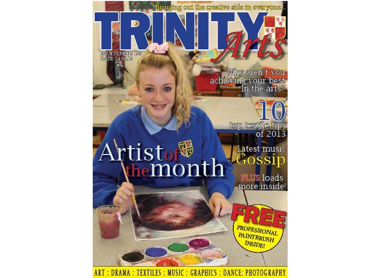
Cover: I have made some final changes to my pieces to improve them. I have changed the font style of the bar at the bottom, and also made the yellow bar smaller. I rotated the word 'FREE' around more to show it has clearly been put onto an angle. Lastly I changed the colour of the issue number and the date to make it stand out more clearly from the background image.

Content: Also i made some to my contents page, i moved the pictures around the page so the page numbers are now in order, this makes the page easier to read for the audience. The font previous was hard to read so i changed it from a sans serif font to a sans font, this is more suitable for the target audience and also is easier to read on the page. I changed i filled in the empty spaces that were on the page by cropping the images to make them spread across the whole column on the page. Finally i made the spaces between the content smaller.
Wednesday, 6 February 2013
Final contents page

This is my final contents page for my magazine I also followed the drafts I had drawn up originally. On both drafts they had a bar running down the page to separate the contents stories from the title. In production I ended up adding another bar I think this works well as it separates my features from my regulars and makes the whole page easier to read for the audience. Another thing I changed was the numbers and placement of the features and regulars title. I think this was a good change as it does make the page clearer and the layout a lot better. I think that the photograph of the splattered paint works really well as the background, as it fits in with the conventions of the Arts. Changing the layout of the contents page made it look quite realistic, like a real school magazine. Throughout my two final pieces I have kept the same house style and colours throughout.
Final magazine cover

Here is my final magazine front cover I followed the drafts that I produced for previous tasks. I based it around my first draft design which was firstly aimed at the age’s post 16. But I wanted to change to age so that it would appeal to the whole of the school, this includes ages 11-18. The cover lines within my magazine are what make it appealing to all ages and genders. I used the most engaging image to become the key image for my magazine. And I created a main story to link in with my picture. All of the cover lines and stories fit in with the correct institution and audience for my school. The pictures I have used hold the correct conventions for what my magazine is based upon. Also I think the layout works really well and creates a good feeling for a school magazine. I think my target audience would read this magazine if it was printed.
Monday, 4 February 2013
Background Photography


For my contents page I wanted to have a bright background but I wanted to use my own photography which still held conventions of the Arts. So I decided I would splash paint onto paper and then take photos of it. I decided to use to colours I have used so far in my magazine so it would create and match with the house style. Also I tested whether it would look better with the flash on or off, this is why you can see two different tones of paper in my photographs. I decided to go with the one that had the flash on. Because the paper is brighter and the colours stand out more, this will be eye catching for my audience and very engaging.
Chosen Photographs


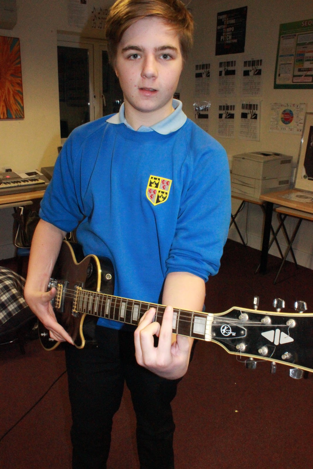


Here are the 7 main photographs I am considering using in my main magazine. I have chosen these because I think they are the most engaging and hold the most conventions of Arts to fit in with my magazine. I think they are good because they vary in the different art subjects which will give my magazine variety and reach to a wider target audience.
Photography


Here are the photographs I took within my school, I knew I needed to take photos of students with the convention of Arts. So I went into some GCSE Textiles, Art and music classes to see if I could get some good photographs. Also I decided to go into the school main hall while the students where rehearing for the production. I think these photos are good because they match conventions and the genre of Art which is the whole idea for my school magazine. After this I will then pick the ones I think are the best and most engaging towards audience, and which ones will attract my target audience into reading this certain magazine.
Subscribe to:
Posts (Atom)